Overall Growth: Taxi vs Uber
While the demand trend for taxi rides remained mostly constant during this period, the demand for Uber rides increased steadily instead.
The demand for Uber exceeded the demand for taxi rides in July 2014.
Use the slider to look at the demand trends for taxi and Uber rides for each month.
A visualization of the total taxi and Uber trip counts for each day during the period of April 2014 to September 2014 revealed their respective demand trends during this period, as well as how demand for each ride-hailing service fluctuated by days of weeks. While the demand trend for taxi rides remained mostly constant during this period, the demand for Uber rides increased steadily instead. The demand for Uber exceeded the demand for taxi rides in July 2014. Despite the difference in overall demand trends, both taxi and Uber’s weekly demand trends exhibit similar patterns - they both peak in the middle of the week, and dip during the weekends. This largely reflects expectations of traffic volume for different days of the week.
Comparing Average Hourly Pick Up Counts for Taxi and Uber
On average, the demand for both taxi and uber rides increases as the day progresses. This demand peaks during the morning rush hour and evening rush hour periods.
It is interesting to note that the demand for taxi rides lags behind the demand for Uber rides - it peaks an hour behind Uber’s demand peak, and troughs roughly three to four hours after Uber’s demand trough.
Click and drag an interval on the line plot to look more closely at how the total number and proportion of taxi and uber pick-ups vary at different time intervals of the day.
On average, the demand for both taxi and Uber rides increases as the day progresses. This demand peaks during the morning rush hour and evening rush hour periods. What is interesting to note is that the demand for taxi rides lags behind the demand for Uber rides - it peaks an hour behind Uber’s demand peak, and troughs roughly three to four hours after Uber’s demand trough. This raises several points worth further consideration. Firstly, considering the fact that Uber implements peak pricing methods, and prices generally increases as demand rises, this may suggest that the demand for taxis increases when individuals switch over from Uber to Taxi as prices increase. If further studies prove this effect to be true, this brings into consideration the evolved role of taxis as price substitutes for Uber. Secondly, the observation that the demand for taxi rides is lower than Uber rides during peak hour, but higher during off-peak hours, suggest that it might be easier or more convenient to obtain an Uber ride during peak hours, when taxi cabs might not necessarily be circling around areas of peak demand.
Where do Pick Ups Most Frequently Occur?
These GIF images show the taxi and Uber pickup locations respectively, at each hour of the day in New York City between April-September 2014. Each pickup point is represented by a point in the map and brighter areas are characteristics of greater pickup activity.
Taxi Uber
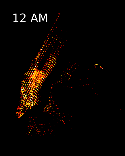
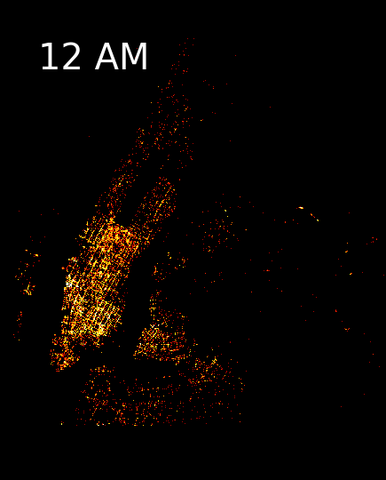
There are clear similarities and differences in the patterns of taxi and Uber pickup locations. For both modes of transportation, there is definitely less activity during the night-time hours (around 1am and 5am) with a surge in pickup activity during the morning and afternoon rush hours as also reflected by the hourly pick up chart above. Much of the activity occurs in lower Manhattan as opposed to the north of Upper East/West Sides and Harlem. The Midtown area seems to consistently be the most popular neighborhood for pickups, as portrayed to be the brightest region for every hour of the day. This is characteristic of the area, as Midtown is not only the largest central business district, but also an iconic location for tourist attractions and leisure activities.
As for the differences, taxi pickup locations follow a more structured pattern, where pickup points follow a grid-like arrangement and more clearly delineate the Avenues and the city’s blocks. On the other hand, Uber pick up locations are more widely dispersed throughout Manhattan, and a there can be seen a greater amount of activity occur in the Southern end of the island, in neighborhoods like Chelsea, East/West Village, SoHo, Lower East Side, and Chinatown among others. Another difference is that taxi pick up points are more centralized in the City relative to Uber pick up points. Uber pick up locations extend farther beyond the boundaries of the island, to regions like east of Brooklyn and Queens. These differences better reflect some of the advantages and characteristics that make Uber unique – people can benefit from this service in locations where taxicabs are less likely to be found.
Data Collection
The data used for this analysis was collected from two main sources. Uber trips data was publicly available online by
FiveThirtyEight via Kaggle. This data was limited relative to the NYC Taxi data, as the trips information was restricted to 2014 (April – September) and 2015 (January – June); together this directory had about 20 million pickup records and could be obtained through a series of CSV files. The NYC Yellow Taxi trips data was available through the
NYC Open Data portal and contained over 180 million and 165 million rows of data between 2014 and 2015 respectively. This data was queried using an API call specifying the file type (geojson), column names and condition(s) to be met. To aid a fair comparison, this analysis queried NYC data during the same time period as the available Uber Data.
Initial exploratory analysis revealed that Uber pickup counts surpassed taxi pickup counts around June - July 2014. Due to data size and data processing time limitations, the 2014-2015 data was narrowed down to cover April – September 2014. Uber data contained about 4.5 mil rows of information; as such, the taxi data was also queried to select about 4.5 mil rows around the same time period. Together, the final dataset used contained around 9 million points.
Data wrangling
All of the data was wrangled using Python scripting language.
It began by loading the Uber data as separate monthly .csv files and combined into one dataset. As for the taxi data, it was loaded via an API call. Given the limited information available from the Uber data (DateTime, Lat and Lon Coordinates), it was necessary that the taxi dataset also contained the same information for equal comparison. As such, the API query specified DateTime, Lat and Lon coordinate fields and a set parameter to call entries between April - September 2014.
Much of the data cleaning process was repeated twice for each mode of transportation. The decision to keep the cleaning separate for each dataframe was due to both data size limitations which would considerably increasing processing time, as well as class type and format for each data source. For example, Lat and Lon coordinate fields were integers for Uber data while the values were imported as strings for taxi data. Another example, the DateTime format for Uber data was formatted as “mm/dd/yyy hh:mm:ss” while the same filed for Taxi data was formatted as “yyy-mm-ddThh:mm:ss.ssss”. This required additional and specific data wrangling procedures for each dataset.
Further steps were taken to keep the consistency of the datasets for better convenience when referencing and manipulating when combining the Uber and taxi datasets. With the resulting basic information, additional columns were created such as mode type specifications (“Uber” or “Taxi”), hour, date, and month (both as numerical values and name values - ie. 4 equivalent to “April”).
Our final wrangled dataset thus contained
type information (`type` is either `taxi` or `uber`),
time information (`datetime`, `date`, `month`, `monthname`, `hour`) and
location information (`lat`, `lon`) for each pick-up recording during this period. This allowed us to proceed with specific analysis procedures that may yield answers to the the three questions we specified on
overall growth, average hour demand, and
spatial distribution of demand. This will be elaborated on in the following section.
Data analysis and visualization
A) Overall growth: Taxi vs Uber
To analyze the overall demand trends for taxi and Uber rides, the number of taxi and uber pick-ups is counted for each day of the 6-month period. To do so, the dataframe columns containing type information and time information were required. As each row record in the wrangled data frame contained these information for a single pick-up, we grouped these records by the type of service (taxi or Uber), and then by the date the pickups were made, before aggregating the sum of the number of pickups in these groups. This yielded a new dataframe of 266 rows - there were 183 rows representing the total number of pickups for each of the 183 days during this 6-month period for each type of service.
To present this information, we chose to represent it using a line plot. This best illustrated the day-by-day demand fluctuation patterns for each week, as well as the overall growth in Uber pick-ups relative to the almost constant taxi pick-ups. Other forms of visualizations we considered included the heat-plots which could have represented the pick-up counts in terms of day by day tiles or pixels colored by relative intensity. However, it was ultimately decided that the demand trends were more intuitively understood from the line plot, which was thus presented on our final web dashboard.
An interactive slider function was also provided for users interested in viewing month-specific trends. This provides a ‘zoom-in’ look into each month. As users slide along the months from April to September, the switch in popularity between taxi and Uber is even more apparent visually, as the black line representing Uber pick-ups goes above the yellow line representing taxi pick-ups from July onwards.
B) Comparing Taxi and Uber average hourly pick-up counts
To analyze the average hourly pick-up counts for taxi and Uber rides, the number of taxi and Uber pick-ups was counted for each hour of the 6-month period. To do so, the dataframe columns containing
type information and
time information were required. As each row record in the wrangled data frame contained these information for a single pick-up, we grouped these records by the
type of service (taxi or Uber), and then by the
hour the pickups were made, before aggregating the sum of the number of pickups in these groups. To get the
average hourly pickups, this sum was then divided by 183, which was the number of days in this 6-month period. This yielded a new dataframe of 48 rows - there were 24 rows representing the average number of pickups for each of the 24 hours during a typical day for each type of service.
To present this information, we chose to first represent it using a line plot. Again, this best illustrated the hour-to-hour demand fluctuation patterns for a typical day. The use of the same plot type also reinforced visual consistency for the users. To supplement this line plot, we also presented the average total number of pickups for each type in a bar chart. To present the competing shares of the market at each different hour of the day, we also plotted the relative proportions of taxi and Uber pick-ups. Here, users can easily observe how Uber captured most of the ride sharing demand during peak hours, while taxicabs captured most of the ride sharing demand during off-peak.
An interactive brush was provided for users to select an interval of time that they might be interested to observe. Applying this brush on the line plot automatically re-adjusts the values in the bar chart presenting the average total number of pickups - the total will reflect the aggregated sum for only the interval period specified. At the same time, the axis for the proportion bar chart is also adjusted to only present the proportions calculated for the same interval period specified.
C) Where do pick-ups most frequently occur?
To analyze the spatial distribution of demand for taxi and Uber rides, the dataframe columns containing
type information, time information, and
location information were required. Unlike the previous analysis, we left the observations in its original disaggregated state, as each point plotted in the spatial visualization represents a single pick-up. However, this dataframe had to be converted to a geodataframe - the coordinate system used for the geodataframe projection had to be specified and converted to web mercator projection using the geoPandas library for plotting using the dataShader library.
The distribution of pick-up points for each ride-hailing service type was mapped for each hour. In total, 48 of such maps were produced. These maps were then grouped according to the service type it represented and arranged and appended in chronological order. This allowed the maps to be presented in a GIF format, which effectively visualized how the hot spots and spatial extent of demand for taxi and Uber rides was distributed across New York City.